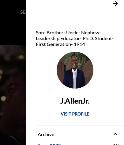
What a perfect challenge to engage in! It is time for a CHANGE. Change is good. Change is scary. Change is important. I was curious to know how I wanted my blogger site to look when we were tasked with creating our blogger account. I went with something that felt "safe" or comfortable to my liking. I wanted to represent myself, given the headshot. I added something representing my fraternity, and then the overall color with the orange sunset vibe felt like something I would enjoy. I went with some standard or default choices regarding my fonts, backgrounds, and gadgets. The options were endless; I was correct! My blogger design worked for me, and I did not feel like it was something I would grow to hate or dislike. Due to the blog makeover challenge, I am open to embracing this new change! I changed parts of the layout; I chose a different color and switched some fonts to provide a more contemporary feel, look, and vibe. Any suggestions? Thoughts?
I am willing to continue to explore and change my design. If anyone knows how to bring my headshot from the right side to the front of my page, PLEASE let me know! Even though I started the challenge this week, I will keep adding pieces.


Hi Johnnie! The new design looks great! I admire your ambition to keep editing and adding new design elements to the blog. I know it can be overwhelming with all of the options, but it is definitely fun to play around with!
ReplyDeleteP.S. I think you can center your headshot by going into your them and then customizing the layout. On the left side of the customize page there is an element where you can arrange the page layout.
Hi Frankie! Thank you so much, I am glad you like the new layout! Yes! I could not figure out how to do that but now I will be sure to make the adjustment!
Delete